Part Three - Chapter Covers
Conceptualising some covers
|
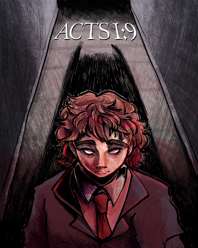
So I kind of got a little excited by this point and wanted to immediately work on some covers, mainly the chapter covers which will be in between every chapter as a sort of breakout and something colourful to look at. This was just an initial concept, though I was told it looked like Ricin was batman, which, now that I'm looking at it, yea I see it. So I went back to the drawing board with it.
The first chapter of the comic shows Ricin traversing through new york in search of heroin, when all of a sudden a stranger called Rudy comes over offering him what he wants in return he leaves New York for good so Rudy can have peace of mind running the underground crime scene without a deadly serial killer on the loose. It's obviously a trap and once they return a fight breaks out only for it to end in a saucy smoochy smoochy scene (thats right, saucy, and smoochy) Capturing the whole chapter in one cover? Is sort of a challenge itself. I went about it a different way instead |
Chapter ONE cover
|
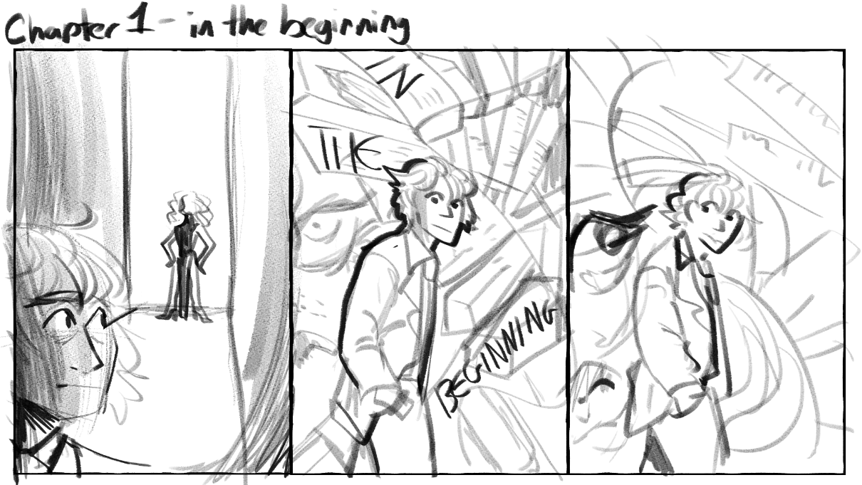
I started by making these thumbnails for the chapter one cover, first was a more literal version of the events that are about to transpire but then I thought, you know what would actually be fun? Do something a bit weird, a bit quirky, a bit abstract. Seeing as the first chapter is a bit of a mess of events happenings, all surrounding the protagonist Ricin, I thought it would be more interesting to draw him surrounded by a vague concept of everything that is about to transpire.
|
|
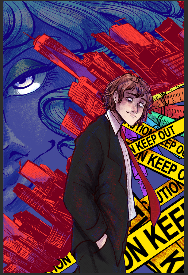
I drew out this composition with the Ricin in the foreground and the background being very busy and chaotic. I liked where I was going with it, but it lacked uniformity I feel. Also I was told the text going over Ricin doesn't work so I guess I was back to the drawing board with that one. (though I did like the concept of it, I have to agree, it doesn't really work unless I silhouetted him but I already drew him out.
|
|
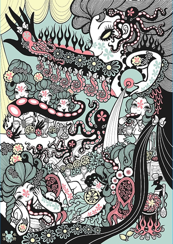
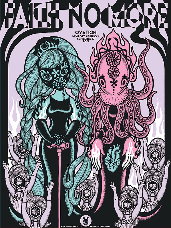
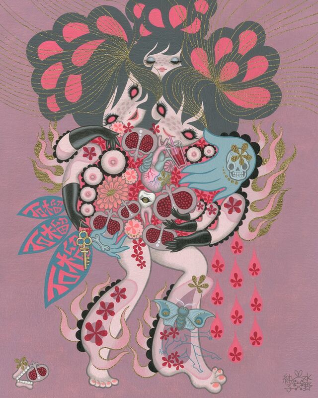
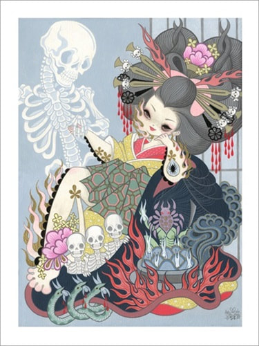
(note this still isn't the final version? But we're getting places with it) I still feel like I need to edit the colours a little but I think the overall vibe is a lot better on it. I took a look at Junko Mizuno's work as inspiration, she does a lot of work with busy backgrounds and I realised real quickly that what makes a chaotic busy background work is a uniformity of colours, so the eyes aren't going about everywhere. The uniformity is helping but I still wasn't happy with it.
|
|
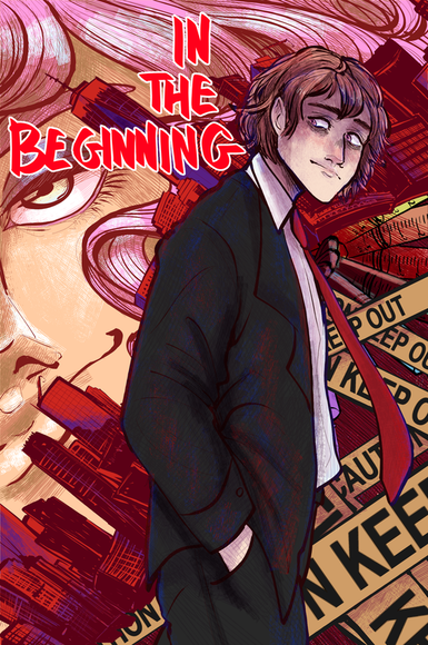
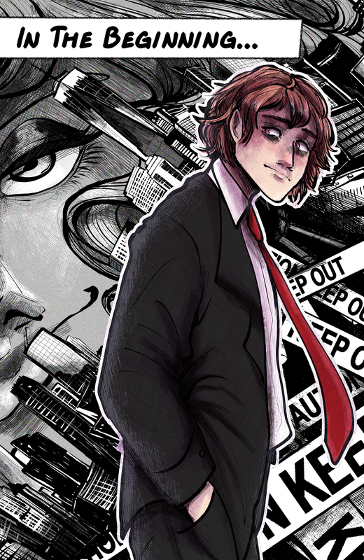
This is the final render I came up with for this chapter cover, after editing it a few different times. This was after doing the other two chapter covers, I finally understood what was off about it, though I did like the more consistent colour palette I did above, I think this was better. I also decided to do this change after I had done the other chapter covers, this is because they all have their own theme that I went for in some way or another and it created an issue with the first cover, it felt like this one didn't have a cohesive theme compared to the others. So asking the opinions of some friends who had read the first chapter, the consensus that it had a bit of a Noire feel to it, with Rudy's aesthetics and Ricin in his suit and the Rolls Royce, the back and forth dangerous banter.
|
Chapter Two Cover
|
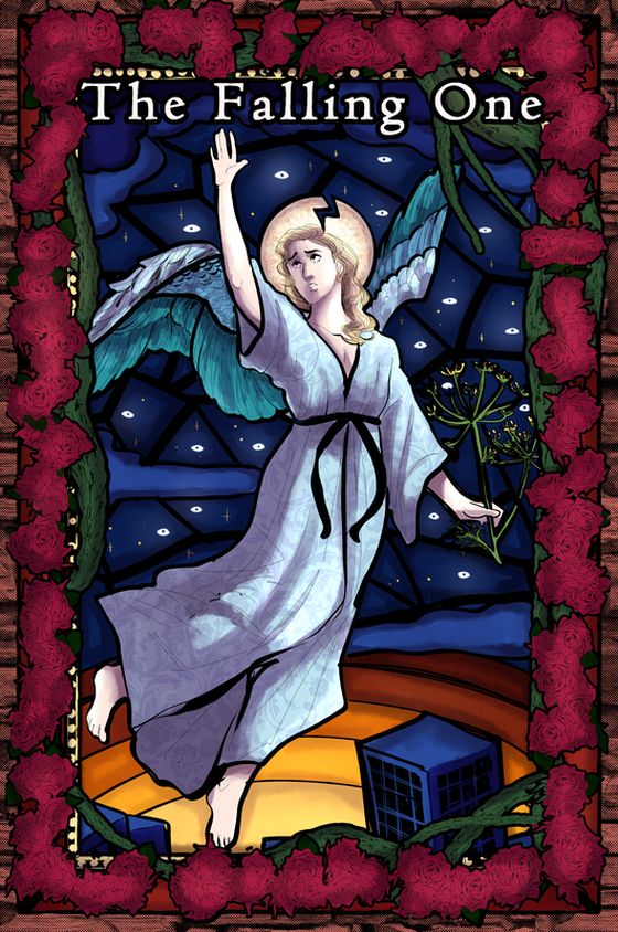
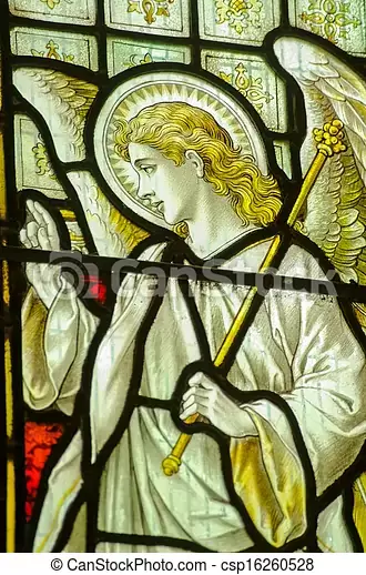
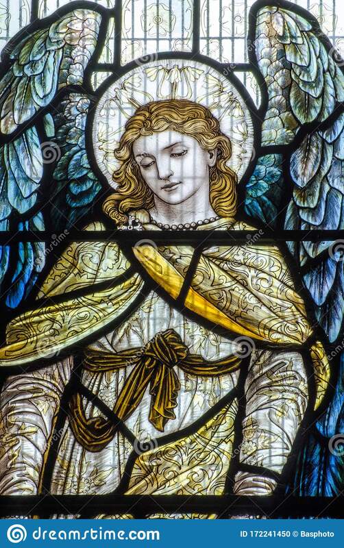
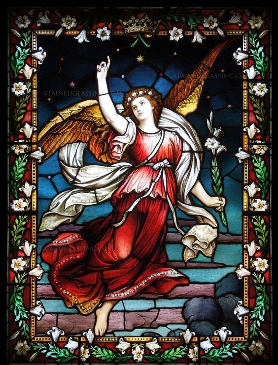
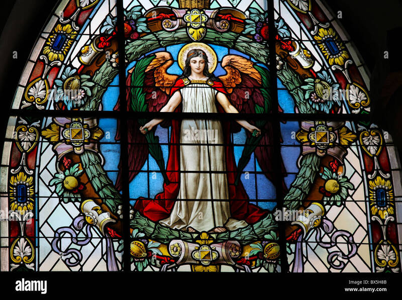
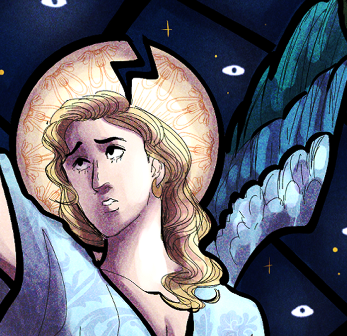
This poster was based off stained glass windows you'd see in church, I looked at a variety of different stained glass windows as inspiration. I decided on one particular pose from the research I did, I chose this pose because of the way it conveys the feeling of falling like the chapter title.
Another part of the cover is the city towards the ground, a narrative part of the piece that shows the character falling towards a modern Earth. There are two flowers shown as a part of the composition, one being roses, one being dill. Both in the language of flowers meaning lust and passion which is relevant to Claud's backstory and why he was kicked out of heaven. The eyes in the background of the piece are also foreshadowing to a later panel in the story. The colour of his robe as well, a baby blue, represents naivety and his lack of purity, because of the white that's usually associated with angels. Finally there's the broken halo, representing a fallen or broken angel which is exactly what this chapter is all about. |
|
For final adjustments I changed the colour and texture, to give it a more almost vintage feel, like it's been photographed by an older camera and has some pixelation to it.
|
Chapter Three Cover
|
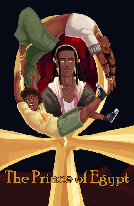
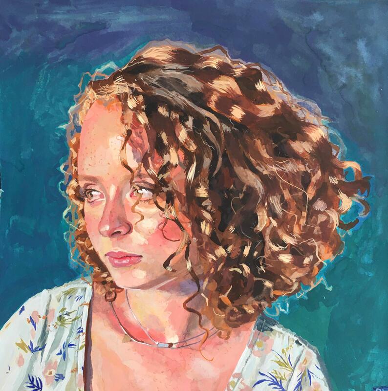
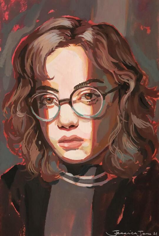
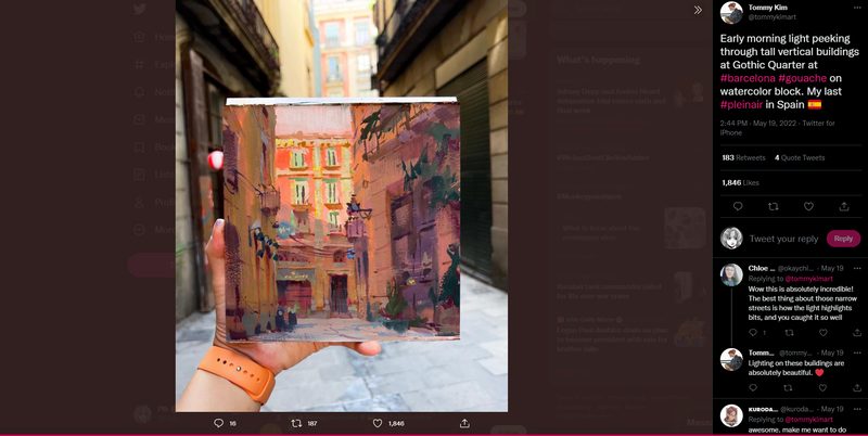
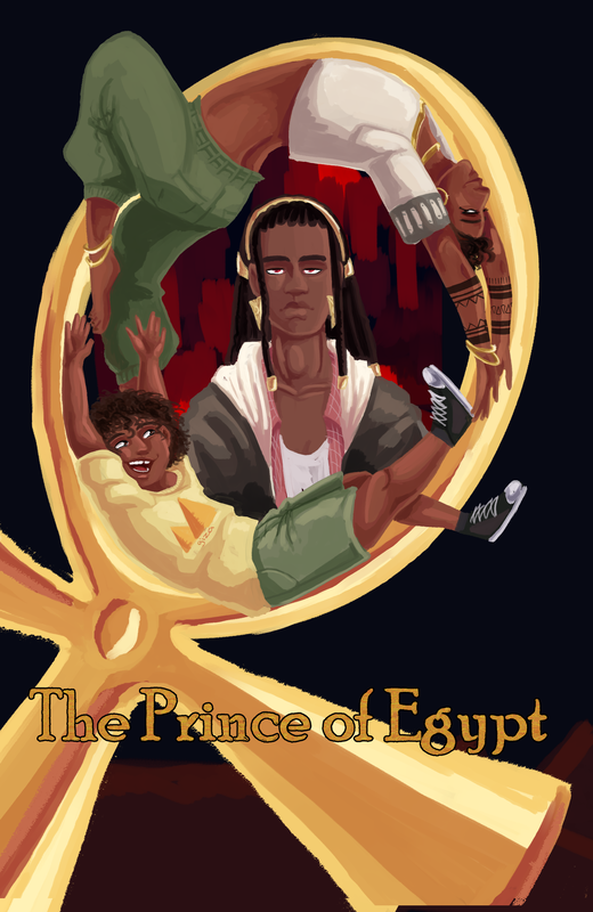
For this chapter cover I decided to do something a little different compared to the other two, I wanted it to be a painted or at least look painted. I decided on a gouache portrait look after looking at Tommy Kim's work on twitter, I love the bright and airy feel of his work while still retaining some detail using thicker brushes to create an illusion of detail.
This chapter is about family, and a weird one at that. Sabra is an Egyptian demigod, his mother is Hathor and his father is human, he is related directly to the god of chaos Seth, who has been outcasted from his family for committing crimes in the long ago past. I wanted to convey both a sense of family and the sense of Sabra forming an emotional bond around the jaded Seth who now due to him being outcasted no longer feels Egyptian. Sabra starts to bring back that old feeling of power that he misses, this is essentially what the chapter is about, as well as introducing Sabra as a character. He is important and essential to the plot, as Ricin's deuteragonist. Below is some early concepts |
|
After reading some suggestions and feedback from my lecturers and facing some unsure feelings about this piece, doubting my ability as I always do. I decided to change the direction the ankh is going, this creates an a lot more interesting piece as it creates an asymmetric pattern which could symbolise the imbalance and disjointedness Seth feels towards his home culture. I also believe it being like this also shapes the circular shape the composition creates. All in all I became a lot happier with this piece after making my final adjustment.
|
Site powered by Weebly. Managed by 34SP.com


