pibisisland.grillust.uk
  • Home
  • Blogs
    • Briefs blog
      • 5060 research blog
  • Modules
    • ILLUS5020
    • ILLUS5040
    • ILLUS5050
    • ILLUS6040
  • ACTS 1:9
  • Home
  • Blogs
    • Briefs blog
      • 5060 research blog
  • Modules
    • ILLUS5020
    • ILLUS5040
    • ILLUS5050
    • ILLUS6040
  • ACTS 1:9
Search

The signs of the universe

session 3: decoding advertisements

3/9/2021

0 Comments

 
For this week's session we started to look into and decode the messages in advertising and understanding how ads can be appealing to us and how they manage to sell us products. I remember my brother who works at Tesco about the phenomenon behind getting people to buy stuff in stores, apparently a big factor in most supermarkets are the shelves at the end of every aisle as you're passing between them, they usually sell products on offer there with deals and such and a vast majority of profits come from these shelves with ever shifting products. It's kind of unrelated but the psychology behind advertising and getting people to buy things with subtle means is very interesting to me so this week's session came into that interest too. 


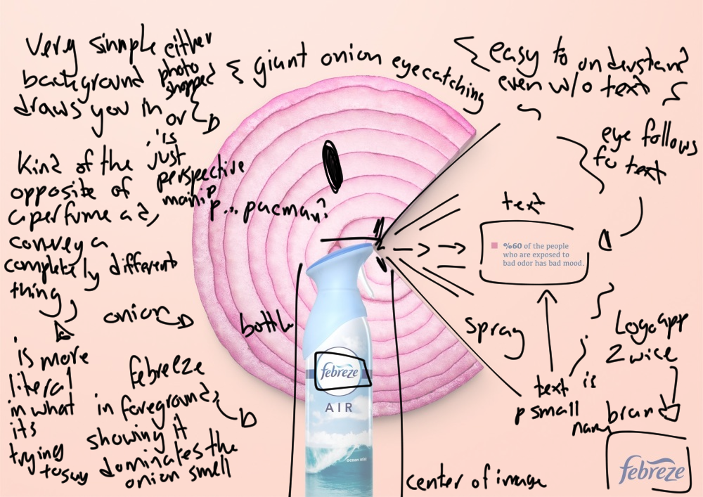
during the session we analysed two different advertisements and how they appeal to us with subtle signs embedded with the positioning, text, slogans, images, colours, etc. Here are the notes I took from the session, sorry if they're a little messy, I just quickly wrote on top of the image. 

Picture
I have also gone ahead and analysed an advertisement I found online, because I haven't been able to go anywhere to buy a magazine, sadly.

literally:
the advertisement displays a drastically oversized onion in the background with a triangular chunk cut out, a febreeze bottle in the foreground, text, brand logo and title and a plain orange tinted background with no indication to where it is. 
image message: to me the image message is more outstanding then the linguistic message behind the ad. The onion in the background is dramatically oversized, impossibly big, a metaphor perhaps to how much onion packs a punch with its smell, overwhelming any other smells in a home especially when cooking. A smell we can all distinctly imagine, although it's not necessarily unpleasant, just overwhelming and huge which is why I believe they used it. The onion too has a huge triangular chunk cut out of it, which fits perfectly into the spray range of the Febreze. implying that the Febreze has cut a chunk out of the smell, the shape alone of the spray is almost iconic for Febreze. The bottle itself is placed on the foreground, right in the centre of the ad, drawing your eyes in, and in the golden zone as I've heard it be called which is about a quarter up the page from the bottom and often to the side, is the logo with another logo placed in a slightly bigger size in the corner. 
Linguistic image: the text is both the Febreze logos, the word air which is one of their flavours I believe and the fun fact on the side. The logos themselves are strategically placed both in the centre of the ad and towards the side so your eye can go from one end to the other, it is the second thing you look at, as your eyes initially train on the image to the side before searching elsewhere for anything else and they are naturally drawn to the logo text in the corner, emphasising the brand importance. The other text is a small fact of sorts with the phrase "60% of the people exposed to bad odour has bad mood." the text is surprisingly small compared to the rest of the ad and is almost easily missable, however to combat that the advertisement has the Febreze bottle pointing towards the text with the onion pointing the same direction so your eyes are naturally lead towards the text to read them. I'm not sure about the meaning of the text itself, other than it has a factual scientific feel to it, as if to give it an official professional vibe somewhat. The flavour(?) of the Febreze being called air which the type itself is spaced out, giving it an airy and light feeling to it, somehow as well it being called air further emphasises the idea of a wind like quality cutting through the onion.
0 Comments


Leave a Reply.

    Author

    Write something about yourself. No need to be fancy, just an overview.

    Archives

    April 2021
    March 2021

    Categories

    All

    RSS Feed

Site powered by Weebly. Managed by 34SP.com
  • Home
  • Blogs
    • Briefs blog
      • 5060 research blog
  • Modules
    • ILLUS5020
    • ILLUS5040
    • ILLUS5050
    • ILLUS6040
  • ACTS 1:9