|
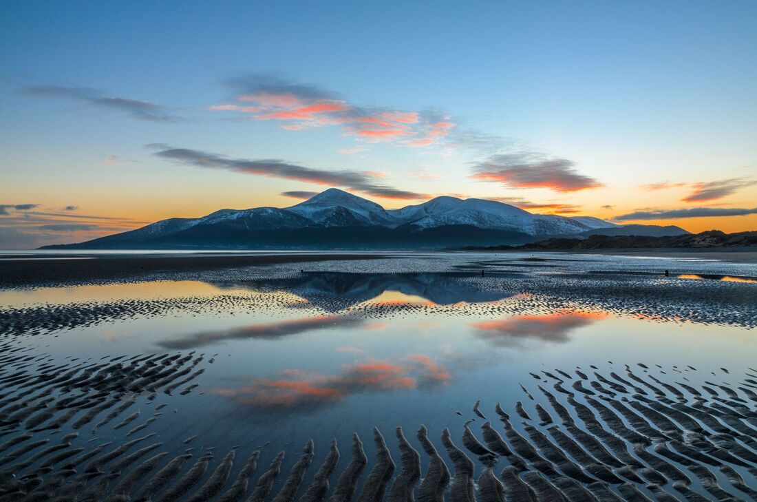
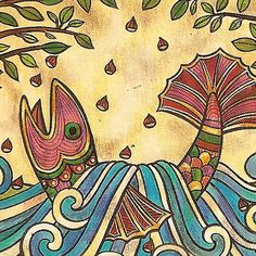
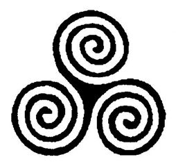
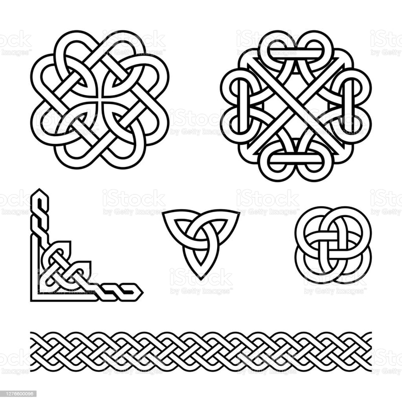
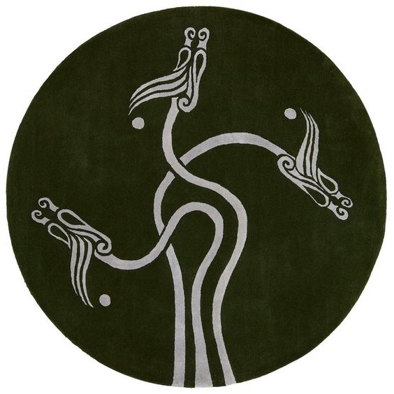
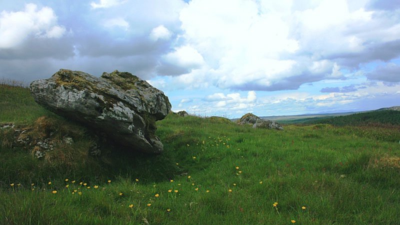
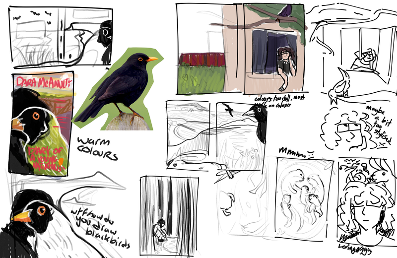
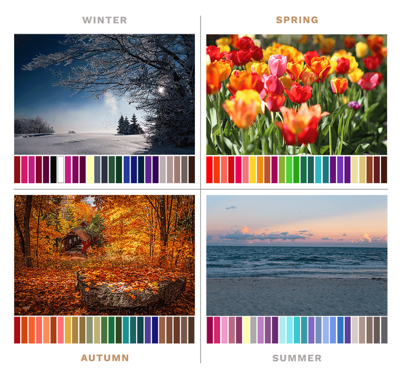
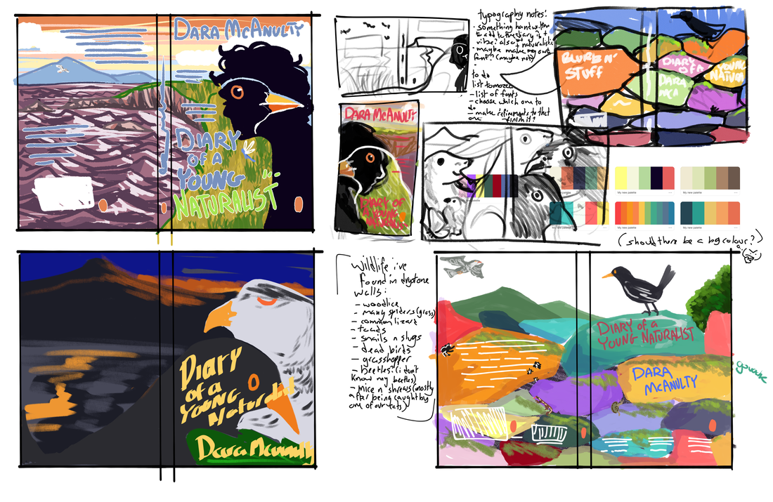
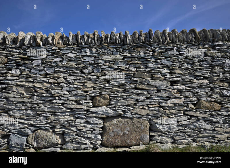
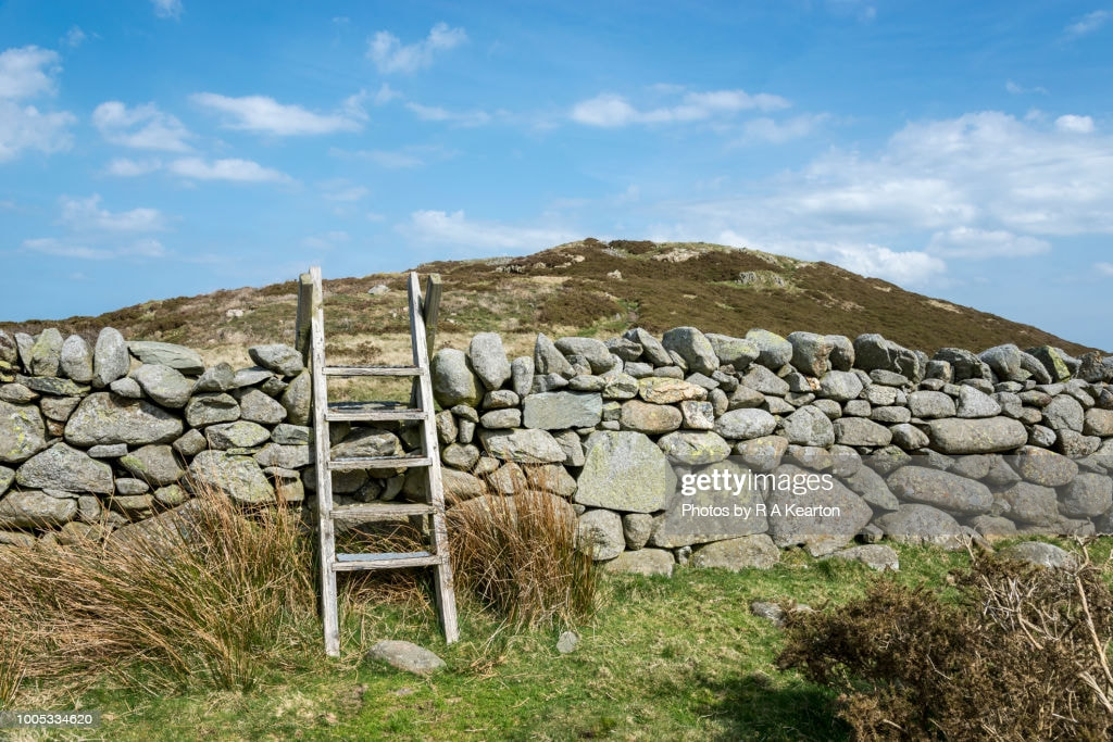
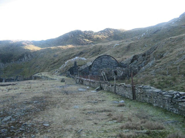
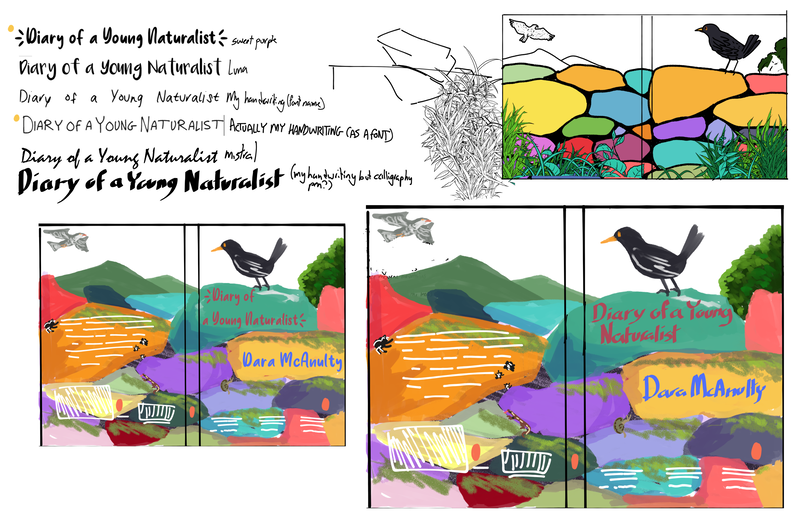
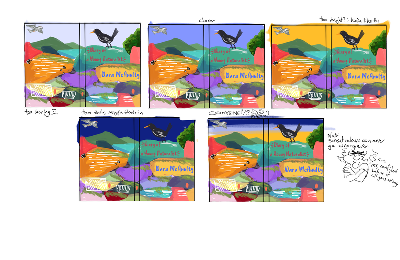
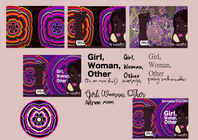
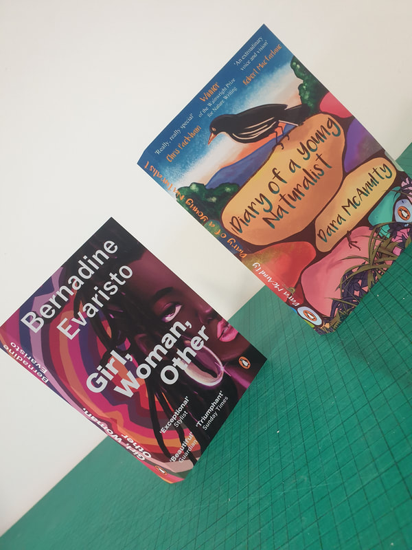
For starters I would like to mention that the choices for this brief were way out of my comfort zone, but that's okay, because I think I'm happy with what I've managed to produce in the end. The process was stressful, I struggled a lot with coming up with ideas but in the end I managed to produce something I'm proud of. Diary of A Young Naturalistimage of a mind map I did while listening to the audiobook Out of all the options given I was most in love with Diary of a Young Naturalist. It made me feel young again, growing up in the countryside in Wales I had a connection with nature growing up. Some of which were fun, others were gross looking back (including playing with cow pats, we used to wait for them to dry over summer and play stepping stones with them, finding some satisfaction in the way they would crack and crumble.) Dara's relationship with nature was something I could personally connect to, as I also grew up in a celtic land full of folklore and history and dramatic mountains and ancient forests. I actually started off my research by looking at various celtic symbols and folkart, I wanted to perhaps develop an idea involving it basing if on how much he writes about various different Irish folklore especially with the landscape and nature. However I ended up not using this as a basis of my development and instead was lingering in the back of my mind, I kind of wished I had looked further into it and perhaps come up with some ideas around it but it was the basis of my start. I also took a look at the locations mentioned in his book, I was particularly drawn to images of the Mourne Mountains, reminding me of Snowdonia and where I grew up, the Mourne mountains look similar to the Moelwyns in Wales, two different mountains called Moelwyn Mawr and Moelwyn Bach which are attached to each other. Mountains are always in the background of my mind and I wanted to include these mountains in my final piece somehow, after this I decided to start my development through thumbnails. I feel like I started off by delving into too many different ideas, I was kind of excited by the book and Dara as a person himself, he had an interesting personality and I really enjoyed his pure ideas and close connection to nature. What stood out to me was his mother calling him a blackbird and his love of them, I definitely wanted to include a blackbird in my final piece as you can see through my thumbnails I included them a lot. I started with the idea of somehow merging the image of a blackbird with the silhouette of Dara combined with nature behind him, linking all three as the book intertwines life, Dara and nature. However I feel like that idea wasn't convincing enough on its own, or I couldn't get it to work no matter how much I tried to edit and develop it so I would move onto separate ideas. One idea I really ended up loving was the image of the drystone wall, but instead of it being its usual grey and beige colours I decided to change it to various different bright colours. At first the colours I chose were random but then I decided to look at various different colours of seasons as part of my development. Upon my travels of searching for good sources stumbled upon Dara McAnulty's blog, which features some of his experiences that he also writes about in his book. I found the images of him surrounded by nature, warm hues which he talks about a lot in his book from the golden sunset to the orange and yellow of a blackbirds beak and the intense amber of a goshawks eyes. I love his descriptions of colour in particular as I've personally always felt a deep connection to vivid bright colours, they make me feel safe and warm, which is why I feel I always am a little more down on a gloomy typical British day where all colours are washed out and replaced by a murky hue. From my look into colours you can see how I was experimenting with my colour palette and coming up with ideas for an overall look for my book cover. At this point I decided I really liked the drystone wall idea a lot more than the others I had started to develop and I at that point had been told that I probably shouldn't be exploring so many ideas at once. I did find coming up with so many ideas quite handy, because it enabled me to combine ideas in a sort of way. Why Drystone Walls Anyways?I was surrounded by drystone walls where I grew up, I had mentioned earlier that I found significance and nostalgia between myself and Dara. The tragic thing is, I lost that love of my local surroundings and nature but Dara's book almost brought it back to me. There was one scene in particular that stood out to me while I was listening to the audiobook, it was only a small scene, a tiny moment in between it all, but it's where Dara mentions going to a drystone wall with his sister, there, he spends a while looking into the wall in search of bugs and other wildlife. It unlocked a familiar memory in me, I remember being a kid and looking into the walls near my house and looking for things like lizards and garden snakes. I loved collecting snails and keeping them as pets too. Mice were always around as well as listening to nearby birds in the trees. I decided to look into drystone walls and see if what I remember was actually correct. I actually found out that drystone walls are a rather beneficial form of walling for many reasons, including providing a habitat for various different species. I took this list of various fauna found in walls and decided to use it in my book cover. The final bits of development were deciding what font to use, what colours I should predominantly use and which colours work together for the final cover. One struggle I did have was coming up with a sky background for the final cover. Because the rocks were so colourful already it would have been a bad choice to go for a bright blue sky as it would definitely clash. So at first of just going for a plain white background however I think that made the colours look a little blander than they are. I did what I'm really good at and thats slapping a sunset setting on everything. Although I guess you could call it dawn, maybe like a new horizon for our young naturalist. The blackbird faces towards the new horizon, expecting another beautiful day as the goshawks goes out for its morning hunt. (Something poetic like that) For the text I knew from the get go I wanted something that looked handwritten but also 'contemporary' if you will. Something not so handwritten it would look childish but not too clean it looked like it was a GCSE how to maths book. The font I found the most appealing to look at as well as fit with the theme was one called Luna. I think it works well with the colourful drystone rocks around it. FINAL OUTCOMEGirl, Woman, OtherA lot of the themes and topics of Girl, Woman, Other were something I could also feel a strong relation to in many ways (even though I am the whitest of white). There was a lot of conversation about femininity and what it means, being nonbinary and finding that identity, trying to fill in a traditional role or fighting against it, sexuality and exploring it healthily or not. A lot of it also struck a chord with me so that's the one I also went for. The only kind of issue I really had was finding a way to define what I really wanted to show in the front cover. I started by jotting down notes as I had listening to instead of the audio book I listened to the bbc radio 4 reading of the book that went from character to character in a condensed way while still getting across the main themes and developments of the book. A few notes I came out of it was
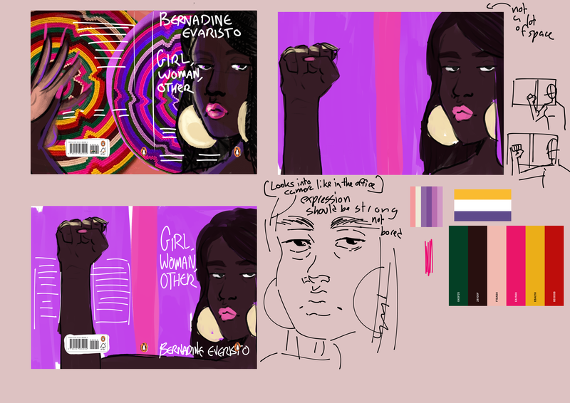
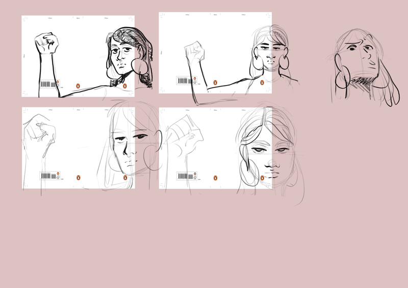
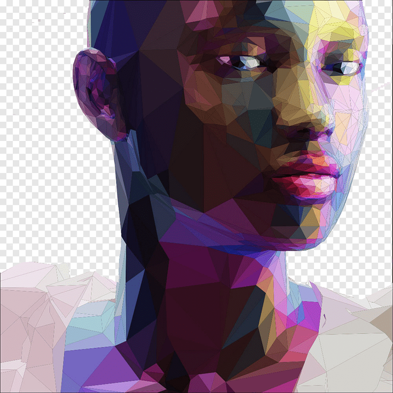
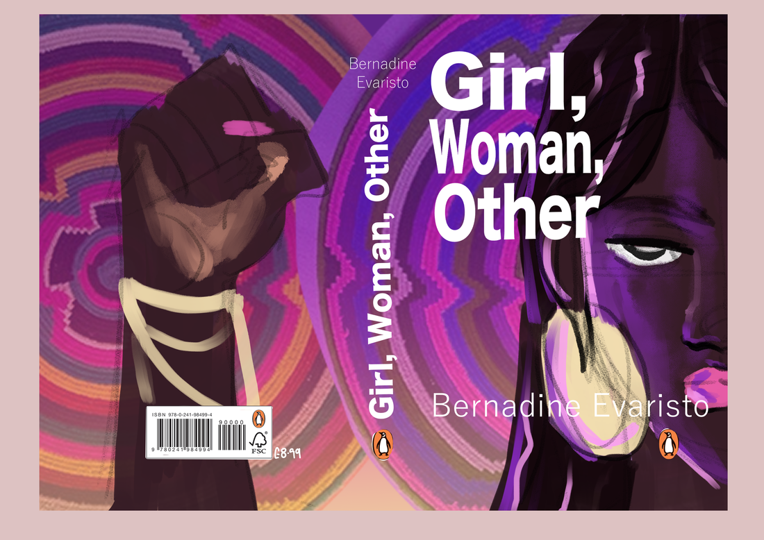
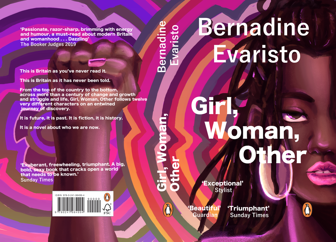
With this book cover I decided not to go too broad and overly increase my scope of design ideas and instead limited it to four main ideas. I mostly took a look at African Caribbean and the relationship to femininity and being British. That was what one of my original focuses was, as well as trying to connect all the characters or perhaps drawing from one character in particular. In the end I think I really liked the second thumbnail I did and decided to solely focus on developing that one. I really liked the description of Amma's character and how her and her theatre is what in the end links all the characters together. I feel like she is the embodiment of being black and a feminist and having explored her own sexuality and being successful in her career as an actress and director. By the present day she has her own theatre company and is the evening of her production about Amazonian lesbians which is a big hell yeah from me.
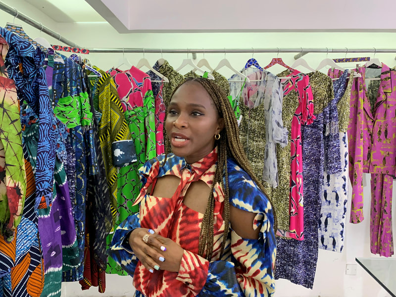
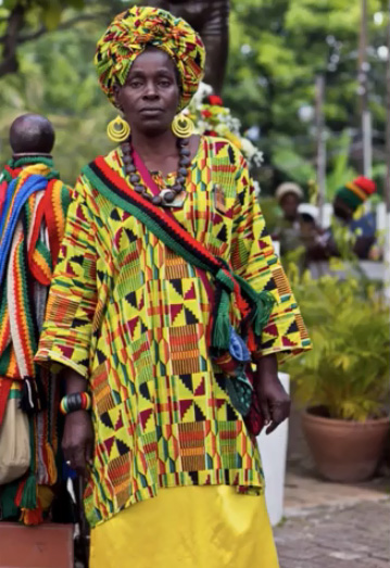
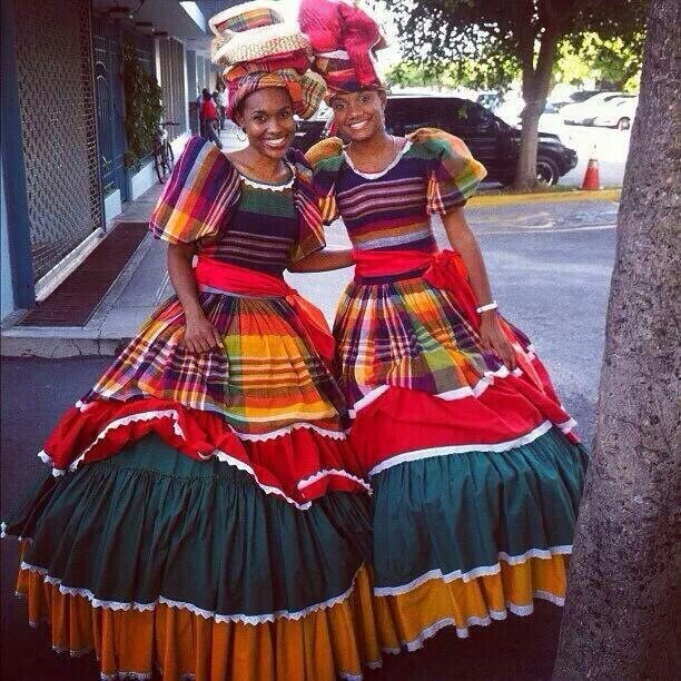
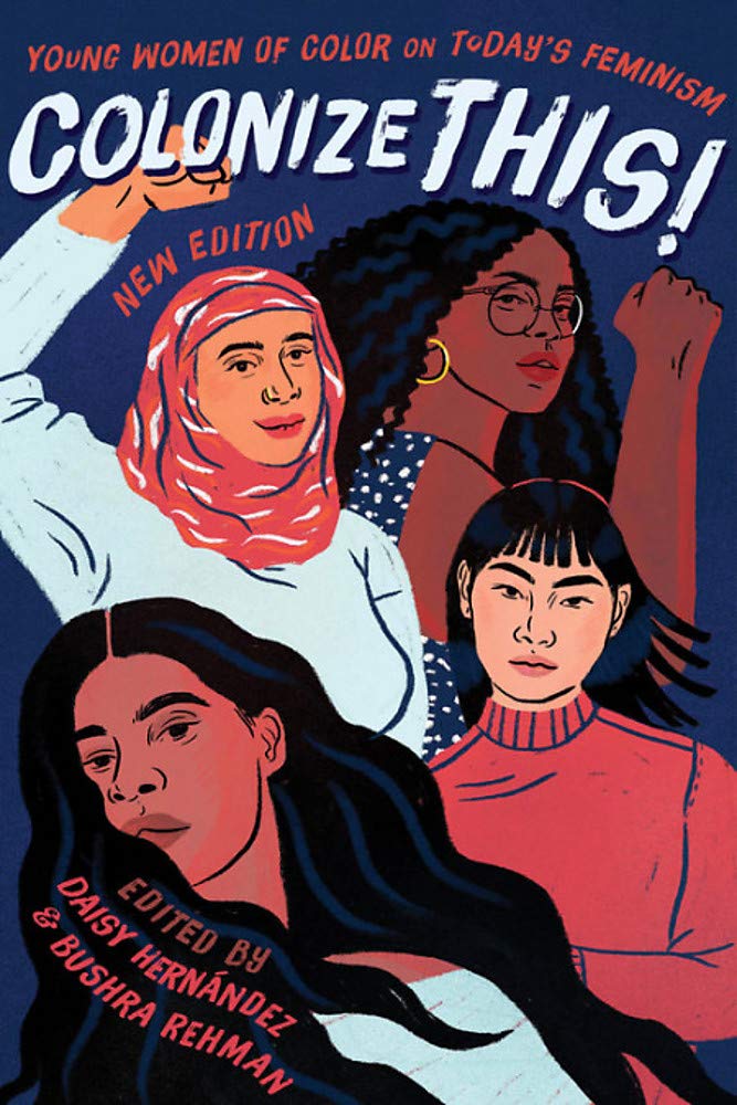
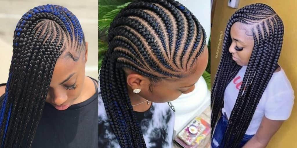
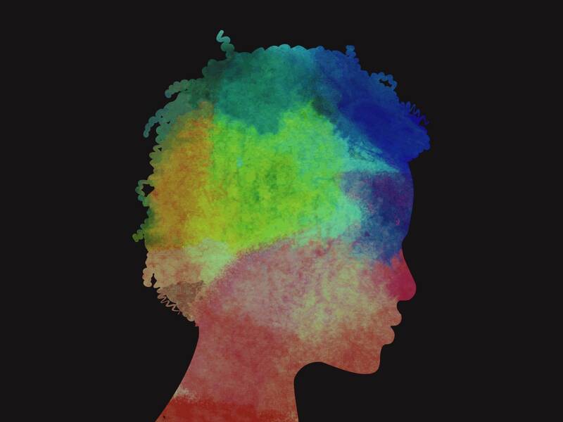
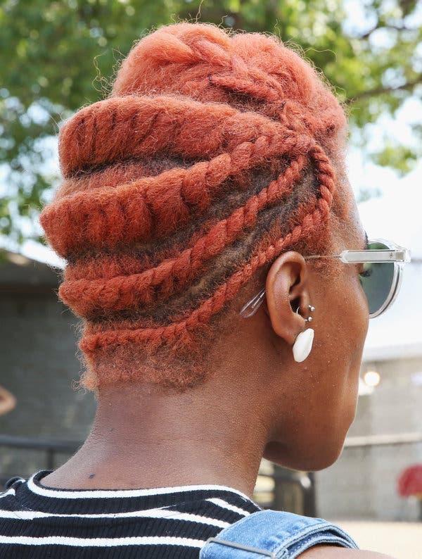
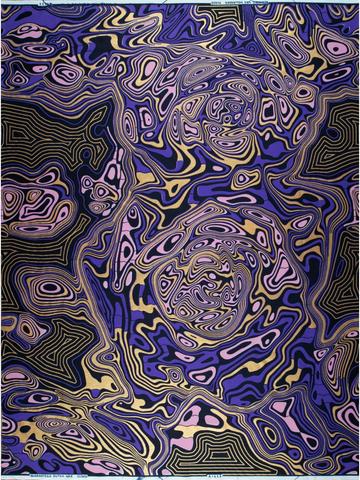
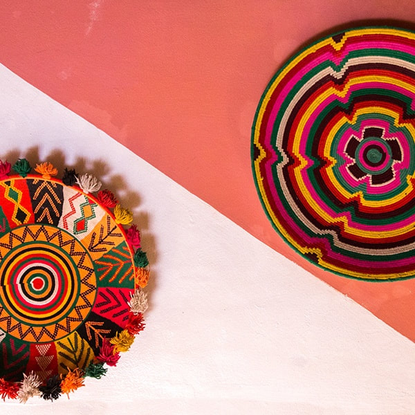
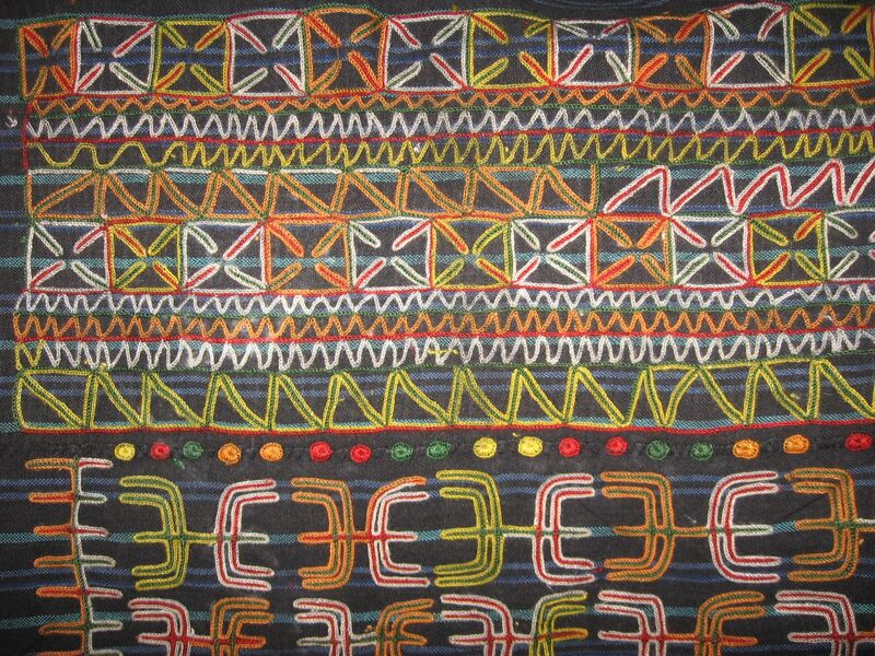
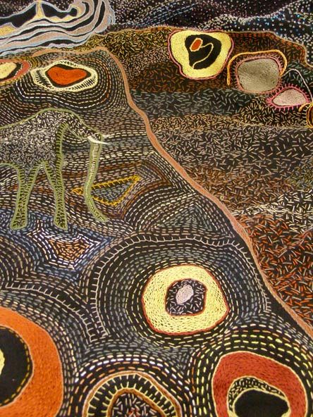
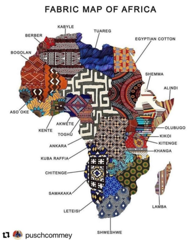
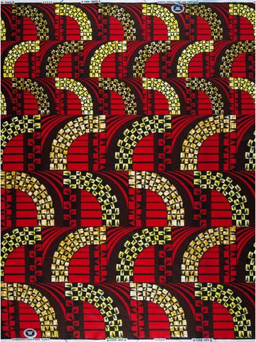
Colours are also an important factor to consider of course. In my mind going into this I mostly thought pink was going to be the main part of my colour palette (as usual) but as it turns out purple is actually the colour associated with feminism. Looking further into it in African cultures purple is seen as an important colour that depicts fertility and feminism, so adding that as a colour felt very significant to my final design. www.sikaa.com/blogs/blog/the-meaning-behind-the-colour (i just really liked this book cover and it inspired me) (looking at some hairstyles and artwork that made me go ooo i wanna do that)
FINAL OUTCOMEBook covers done and done!!
0 Comments
|
Authorhello i'm phoebe! if you somehow stumbled upon this blog congrats! if this was sent to you also congrats! you made it!!! Archives
December 2021
Categories |
Site powered by Weebly. Managed by 34SP.com





















 RSS Feed