
|
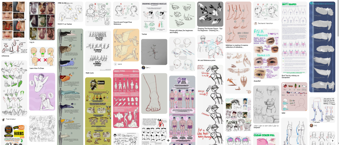
When it comes to anatomical drawings and perspective drawings, I sort of end up doing it in my spare time when it comes to my own personal art, so I found it hard to focus on the basics when I always try to experiment with it in my free time. I also collected a lot of anatomy drawings and perspective drawings on pinterest as part of my research. 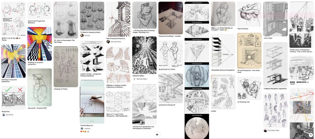
0 Comments
So my idea was to combine K.K.'s glorious smile with his album covers in some way or another, that was my final conclusion to my research, but while I did my research I was producing other sketches and ideas as well, some of which ended up being in the final designs I went for.
I had achieved uniformity but perhaps to too much of a degree?? I'm not sure... I attempted to make each one unique in some way while also heavily sticking to my theme, I'm very happy with how they came out in the end! I possibly should have done more mockups of how they would look as pins rather than as vector images and perhaps that is something I will look into doing at a later date. For now, K.K. keeps grinning.
If you somehow don't know, K.K. Slider is an in-game character that also happens to be a musician in the animal crossing series, I wasn't initially going to focus on him but rather my favourite 'villagers' from the game. But the more I looked into it, the more I realised many and I mean many had done it long before I had. K.K. to a degree had been done a lot before as well but I felt he was the one with the most potential to make something new and fun with because of his repertoire of interesting faces, poses, songs etc. Basic white dog design besides. I knew I could work with a particular feature/features of his that could make my idea stand out and different from the infinite other cutesy K.K. designs.
so after doing research I decided to get stuck right into drawing and coming up with some concepts for my band, I decided I was going to go for a possible grungy pop punk band, if that's even 3 genres that can crossover. Well, essentially I was going to take a grungy punk drawing and give it some bright pop colours. At least that's what I was rolling with initially. A lot of these were concept sketches that I had come about from combining zombies and mushrooms, of course I did some concept drawings of some 'shrooms too. There was one I specifically remember from home where this tree had to be cut down long before I moved in because of a fungal disease. A few years later since moving in there were these massive mushrooms growing on the side of it, thought they looked cool. I kind of wanted to stick to those kinds of mushrooms instead of the classic toadstools. You can also see in my notes that I was starting to form ideas on how I wanted it to look colour wise (I still lack the confidence to apply colour analogue-y)  I then moved onto doing some digital thumbnails and concepts, I kind of knew what I was going for at this point with the colour schemes and illustration however I did want to experiment a bit before just to see if I was happy with that I wanted to go for. The program I use for digital art (clip paint studio) also comes with a wide selection of screentones to choose from so I had many options when it came to what kind of sort of effect I wanted with my poster. Here are the first 2 I sort of came up with, I wasn't especially happy with either but I was happy to experiment with things on my program to really learn what I can do. I liked the second one I came up with compared to the first however it wasn't the vibe I was going for. It felt more indie than what I was initially planning for. Definitely didn't scream the vibe fungal pandemic as a name shouts to me. So I moved onto my final idea.
 The band name I got was Fungal Pandemic, strangely enough it felt very relevant for this year to get such a band name. It feels like to me as a good way to relieve me of my stress that this year has brought me on so far. The first thing I immediately wanted to think about was the feeling the band name gave me, particularly with genre. It feels very punk-ish, maybe a bit psychedelic. Like a modern band that tries to imitate genres popular from the 60s and 70s, a bit of a genre jumper maybe? Going for chaos perhaps like the year at hand. So with that in mind I decided that this band would have something a bit greusome, a bit grotesque as their poster.  Firstly though I looked into mushrooms that I could use, a lot of the ones I found were the type that grew on trees, I began to be fascinated with the fact that fungus really do spread like an infection, I mean humans can develop fungal infections so my brain was sort of going down that route so far.
 Another influence behind this idea was the game The Last Of Us. The game has zombie like creatures that used to be human but are infected with a fungus like disease that much like the fungus that takes over ants, it completely controls a human's mind and takes over their body too. It all felt very fitting to the theme of Fungal Pandemic, and I thought it would be a central theme to the band.  I decided at this point to make a second board on pinterest and look up some zombie related graphics. Unsurprisingly zombies are very popular to draw and a lot of the graphics I found were very similar to the images I was already coming up with in my head. A lot of bright colours, a mix of greens, pinks and purples would be good and eyecatching for the viewer. I had a vision of something graphic and gory but the colours are quite pop-ish in nature and bright as a sort of contrast to the darker theme. Also in general I don't really like zombies, they're the one thing that genuinely scares me in concept so I wanted to at least mess around with some brighter colours. Below are a select few drawings I found to stand out for me from the board! I also decided to generate some colour palettes based on the pinterests using a website I found called Coolers, I've been using it quite a bit recently for my personal work, it's a great way to find colours you wouldn't usually consider. I used different terms such as pop and zombie to find other palettes too that other people had created. It's a handy little resource to find different colour palettes you might want to use and a convenient way to see a colour mood you're trying to achieve before you even fully put colour to paper.   We started off the week with another task where we drew each other on call, which was a very interesting experience! I have never felt so simultaneously comfortable in my own space and uncomfortable that everyone was watching me and drawing me. Perhaps under the pressure of time constraints and the pressure people were drawing me I was almost panic drawing. The first few of these drawings are quite messy when it comes to tonal shading and I believe over the course of the last four weeks I've gotten good at fine liner shading then lost it again immediately. Perhaps I need to return to looking at Alphonso Dunn and study his book a bit more. I have definitely found that over the last four weeks of drawing that fine liners and gel pens are definitely my preferred way to draw. I use a thicker gel pen for a majority of the line work and go in with the shading details later with a smaller fine liner, it seems to be a technique I am exploring more and more and perhaps need to refine. The three drawings above were done during the week when perhaps I was racking my brain out of doing urban sketching and perhaps should have lost the focus on the buildings behind particularly in the second one where I got a bit fascinated with the turret(?) in Carlisle city centre. I was also trying to refine how I was drawing people and also trying to use just pens or just a pen brush and not use a sketch underneath. I feel like these drawings feel a lot more fluid than my previous ones and there's a lot less stress behind them. I have always enjoyed drawing people and I still love drawing them, there is something fascinating about them and I wish sometimes that I could be a hovering ghost just observing people while they had no idea I was watching and drawing (is that? weird? I feel like that's weird. It's late)
In comes Liv! My friend from America! We were just so happening to be doing continents apart homework together when I was as per usual stressing over work, so she offered to turn on her camera and much like the first task we did I drew her for a few hours as we sat and talked on call. Overall a very nice experience and I had some fun doing some gestured drawings of her. I still felt like my drawings were maybe a little too stiff and formal? So i tried loosening up some more and drawing Liv in various different poses as she moved to talk or think or whatever she happened to be doing while we were sat talking. I believe these are perhaps my most favourite drawings of the week as a compilation, perhaps because I've never thought of drawing my friend from America before and she rarely shows me her face in the first place so it was nice to be able to draw her.
Some of the artists I've been looking at over the week mostly come from two books that I bought in preparation for urban sketching, which were: The Art of Urban Sketching by Gabriel Campanairo and Phil Dean's book and guide on Urban Drawing. 
Paul Heaston Paul Heaston is someone else I looked at he is an artist who I was interested in for the techniques he uses to draw. Similar to what I was doing, I used fine liners for a majority of my drawings with a bit of brush pen and ink and pens as a way to fill in black spots to create contrast. Paul Heaston has a very crisp and confident way of drawing which I wish I could too achieve.  Phil DeanPhil Dean is similar to Phil Heaston however he is a lot more fluid in the way he lines and his lines are also a lot more dynamic in nature. Even though I did not go for using dip pens or brush pens as strongly for this part of the brief I still looked into the techniques he used. However I believe I lack confidence when it comes to using dip pens or brush pens and because of that I felt that any work using such tools would look a lot most lackluster than if I used fine liners. Perhaps I should have experimented more but I felt like a beginner or an amateur when it came to doing urban sketching in general so I perhaps stuck more to my comfort zone and instead focused on getting the techniques down.
We were set to do urban sketching as our weekly task. I started the brief off by drawing the view from my back garden. It's just houses and an archway to the street which faces Rickerby park. It's not a particularly interesting view, but I did enjoy drawing the drainpipes, there's something particularly satisfying about them.  Over the weekend I decided to take a nice long walk with two other fellow illustration students and draw some hecking buildings. I talked about buildings in a previous blog post, how usually I struggle with them and usually I hate drawing them because of their minute details and the constant need to think properly about perspective. However over the course of the weekend I started hating them less and less. The drawings I did weren't perfect of course, they were drawn out in the open and I think out of everything this was the hardest part of the brief. I did a lot of them by drawing it out first and working on minute details later at home, it was just so I could bear with the fact I was struggling so much with drawing in public and I wanted to present at least semi decent pieces of work by the end. The first two drawings I did while we were waiting for the third member of our party to show up, I did two drawings of Hotel Chocolat in the city centre of Carlisle. I wanted to capture the brightness of the day through watercolours however I don't believe I was very successful in capturing it in either drawing. The watercolours were a bit washed out and I messed up a lot of the shading in the second drawing, but for a quick two drawings I feel like it could have gone a lot worse. I also don't know why, perhaps the man sat on the bench just playing the accordion or the people outside bars and pubs sitting and drinking beer and the particularly nice weather that day. It just... felt very French  The next drawing I did was of that crescent shaped area near bar solo, apparently I have a thing for rooftops because I keep drawing them for some odd reason. This drawing took a lot less time than the rest only because half way through drawing it a very drunk man came up to the student next to us and started harassing him so before he moved onto us, we decided it was best to leave. Note: it was 2 o' clock in the afternoon when this happened. I don't know what it is about lockdown that's made people lose their minds but people have. Things have just gotten a bit weird around Carlisle I feel. I don't know how but it has.
guaranteed to protect you from 99.99% of viruses
The second and final mask I made was another one of me, I decided to take it a bit more literally however and I also decided to challenge myself a bit and make it out of only shopping bags I had accumulated in my room. I kind of like paper shopping bags, there's just something about them that makes me want to put my head in it. Does my mask count as a helmet or a mask? It feels more like a weird helmet thing. I believe what I used was a mix of a Lush paper bag (it still had a bath bomb in it before I tore it to shreds) A Hobbycraft shopping bag from when I bought overpriced art supplies and a Waterstones bag where I bought overpriced books. I used the Waterstones bag and the Lush bag to make the hair, you can make out part of the designs of the bags in the hair. I of course drew on the fact, the glasses are made out of the handles of the bags and then there's me, going around wearing it and it's almost creepy somehow.  I could make some long metaphors about it being about anonymity and it could be about me feeling shy and anxious all the time and putting a paper bag over my head to cover the fact I just want to curl in a ball and hide from the dangers of the world a high majority of time. Perhaps that is the point of this mask, to hide myself with my little mascot characters and pretending I'm bigger than I am. When I was mulling over what to create, part of me was tempted to create a mask which looked like every annoying anime character ever to mock the fact that most people just see me as another anime artist. Maybe I am. I do try and stand out in this world but everything has been done already and nothing feels unique anymore.
This got deep real quick.
 |
Authorhello i'm phoebe! if you somehow stumbled upon this blog congrats! if this was sent to you also congrats! you made it!!! Archives
December 2021
Categories |


 RSS Feed