
 This is the drawing I did of my bedroom. It took me about 5 hours to draw and it features my favourite angle of my room. I drew it from the edge of my bed so I could comfortably draw it from the lil corner of my room and get ink all over my bedsheets. :) I am fairly happy with how this piece came out, I'm usually way too impatient for drawing details but for this one I was feeling a little more enthusiastic about it and in the end I kind of enjoyed it. The piece itself isn't perfect, I felt like I had grown in confidence with drawing with ink over the week however I feel like I almost went backwards with my technique. The drawing feels more messy in general and I feel like perhaps I rushed doing the tones towards the end of the drawing. I do love adding lighting and shading to drawings, I think I've expressed it elsewhere how it's sort of been my recent fascination in depicting light, ink is a very interesting way to add dynamic lighting because of the way it works. I feel like through this brief I have discovered that I really do enjoy pen and inks, I mostly like to use fine liners mixed with a pen brush mostly because I've always found dip pens hard to use and I didn't have one on me on time to draw this piece.
0 Comments
 So for a lot of the work I did over the past week I have only really been looking at one artist in particular (other than the ones I've been seeing and observing during online lectures, of course) and that's Alphonso Dunn. It was just on a whim that I decided to buy his guide on drawing using pen and ink. Well I say that, but it was actually a lot more than that. In reality, he is an artist that got plagarised by the man who created Inktober (who, by the way, is a massive asshole. Do not support Inktober man, he likes to steal people's work under the pretence the credit all goes to him because he came up with the bland, same old prompts) 
  I started a whole new sketchbook for this brief, that means I'm feeling particularly enthusiastic! I usualy work with ring binder A4 sketchbooks, i preferred the fact I could fold it over however I am enjoying working on A5 and working across two pages, there's something quite satisfying about going across both pages. So this post is going to be about the first week of work I've done based on the brief about ink drawing! I tried as many techniques as I could however about half way through the week I was more focused on the content I was producing than the techniques I was practicing. However I was thoroughly enjoying ink drawing over the past week, more than I thought I would. I felt a bit rusty drawing as over lockdown drawing never really came easily to me. I'm sure other people felt the same way, it was a common issue for artists and illustrators and designers alike. But this felt rather refreshing, it felt like I was just drawing for the sake of drawing for the first time in a long time.  The first thing I felt like drawing was hands, of all things. I'm not sure why, the idea just suddenly came to me. Perhaps because I need to practice hands, they are something that I've always struggled with anatomy wise. I'm sure a lot of people have the struggle so I thought I'd hit two birds with one stone and practice both my hand anatomy and ink drawing. Most of this is done with either brush pens, felt pens, fine liners and bottled ink and brush. Sadly over the past week I haven't had time to go to the campus and buy or find my dip pens so I haven't used them yet. However I'm fairly happy with the work I've produced so far with the pens and brushes. You will probably notice throughout my sketchbook I like to write whatever pops into my head alongside my drawings. Most of the time I'm not even consciously doing it, it's just if I feel compelled to write something I will write it. None of the notes are deep or meaningful. Just ideas, most of the time. The next few drawings I did were mostly random photographs I found in my phone, just finding images that stood out to me. Some obviously more detailed than others. I particularly enjoyed drawing the window in my bedroom. I live in the attic room in a house I'm sharing with other students. It's actually a really spacious room despite the fairly low ceiling and during the day I get a lot of really nice natural lighting. The skylights face right onto my desk so really it's an ideal workspace for drawing! I was mostly focusing on capturing light and shadow as effectively as I could. I think for one of my first attempts of the year, it's not too bad. Obviously there is refining to do but there always is. I hadn't realised until later on in the week that the drawing I had done was relevant to the overall outcome of the brief.
 Sure, I'm fully aware my final drawing was far from perfect or well drawn. Sure, I could do better and it's really not that good and I can see my mistakes in it but for a first attempt in a long time at doing something out of my comfort zone, I was happy. I'm still happy with it. I probably should have stuck to one technique of using fine liners for the whole thing, the brush marks make things seem kind of messy but at the time I felt like it was the only way to convey the mossy rusty look the roofs looked. There were probably other ways I could have done it with mark making but at the time, I was probably tired. This drawing spanned over a day and a bit to produce, not that significant particularly. But I'm one of those impatient people who likes to get a drawing done as fast as possible, possibly why I prefer digital art over analogue. I lack patience, but I feel like at least this year has taught me how to be a little more patient. I feel slower rather than the fast pace I used to go about doing everything. The easy route no longer feels like an option to me.
 The final drawing I did for the week was one I've been trying to do for, several months now and that's record myself as the months go by. Sadly I only took two pictures of myself and that was about at the start of lockdown and the other was, well, today. I kind of wanted to record if I changed physically or if I viewed myself differently at the time. It's kind of weird because the me on the left I barely recognise, at the time I took that picture everything felt like it was the end of the world and I was having a hard time accepting my life had been stripped away from me for the time being. Maybe that drawing conveys it subconsciously, I was trying to draw myself honestly but even the drawing I don't recognise myself as myself whereas the one on the right just feels like regular old me. Fat, tired, me. The me on the left had a tiny amount of hope in her that things were going to get better. At the time, I felt like I would be stuck at home doing nothing for the next year and that I'd never go back to the life I had before. I remember it being such an exhausting feeling and I'm sure a lot of people out there had similar feelings. I don't remember much about the me from then, it was like I disassociated from myself to cope with things and I couldn't tell you much about what happened at the time.
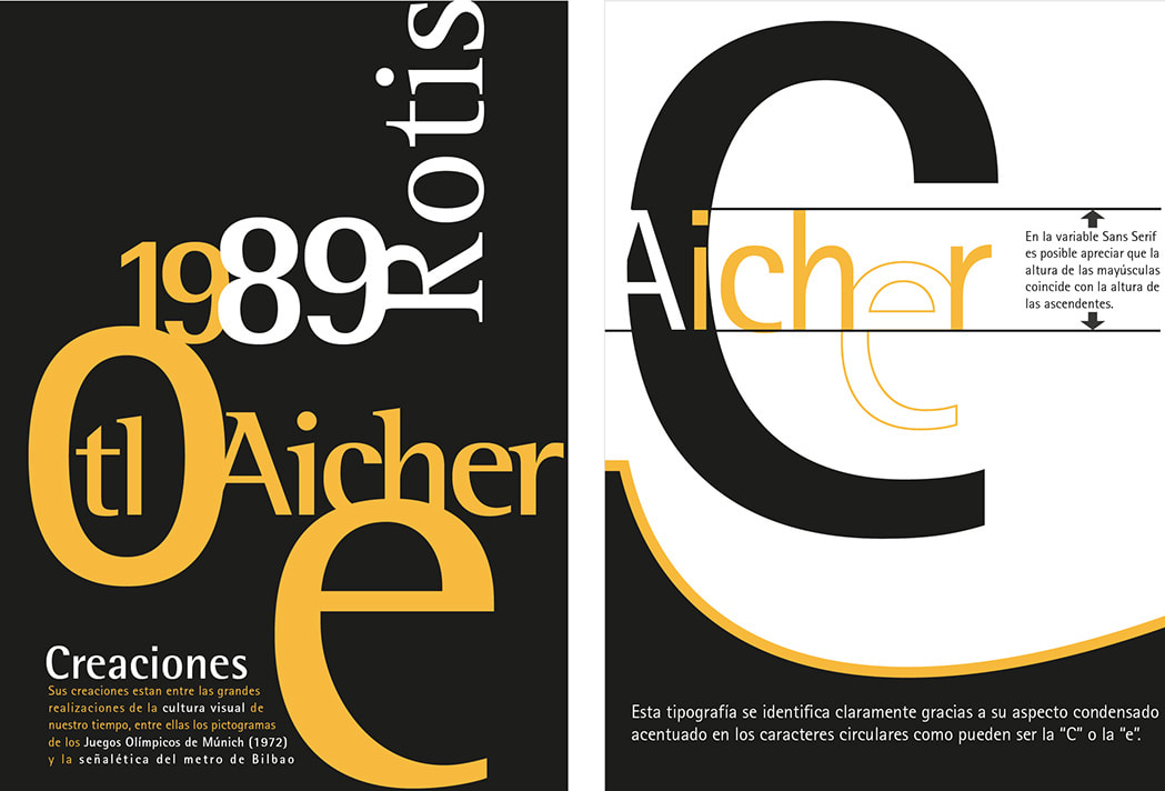
If there's nothing more that will irk a British person it is in fact America post war. Think about it; the fact America had profited so much from war while the rest of the world pretty much had suffered from it to such an awful degree. Cities had been bombed to no return, many people had died from the war, many others suffered from long term health problems. Of course, America did as well but what America is really good at is pretending that the effects of war didn't happen because they were rolling in dollar bills. From this kind of mindset came Norman Rockwell, the king of the everyday middle class white man drawings showing the perfect Amercian suburban man and everything that came with it. Rockwell was especially good at the subtle storytelling in drawings, and I was especially impressed how he could convey so much in a single image. You could really tell what every character is thinking and even start to gather a backstory for the characters shown just based off hints given in his drawings. 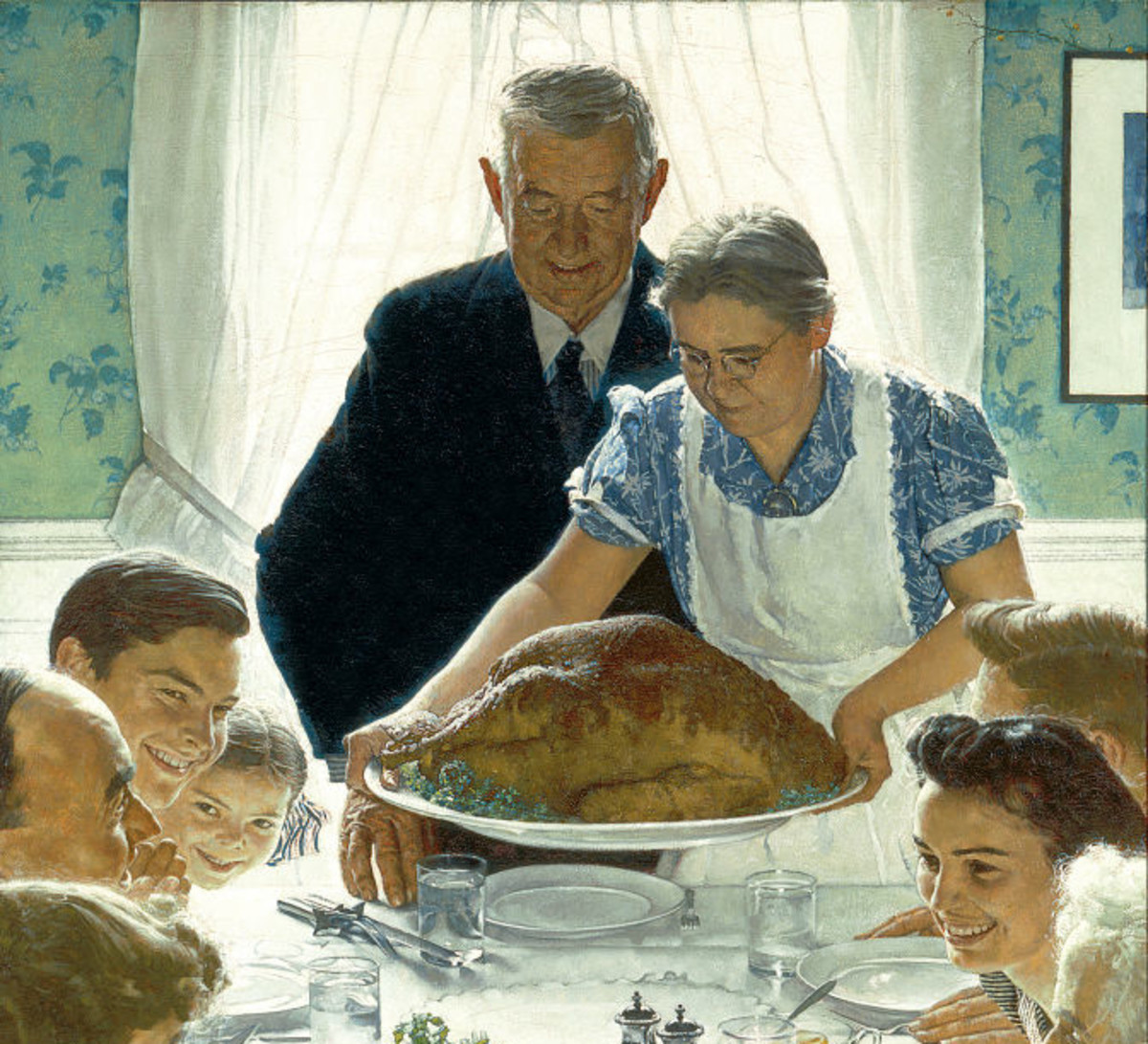 In this drawing you can really see how American's wanted to be viewed from everywhere else and even to their own media. Nobody is unhappy in his drawings, everyone seems so ecstatic to receive their probably thanksgiving dinner. It's all so perfect.  History of Art and Design: High Modernity -'What Makes Today's Home So Different So Appealing'11/6/2019 So to start off with this blog - I'm sorry. This is an absolute mess and probably needs explaining.  So for my recreation of what makes today's home so different so appealing I decided to instead of looking at popular culture I instead looked at internet culture. Now I know it's hard to believe that the internet has a culture, it's more like the rampant chaos you see above you, but that's entirely what I wanted to represent. I think if I were going to name this... monstrosity I would name it 'Meme Culture' or possibly... 'Get a Load of This Society'. These are things I came across while browsing Twitter, mostly. I guess my Twitter feed is a bit disturbing, but its stupid nonsensical stuff like this that kind of puts a smile on my face, so I decided to combine it all and make it into my piece. I also sprinkled in a few things about gadgets and there's a few brands littered around with some other capitalist nonsense, just because I like to put the smallest amount of a political spin on things. I suppose in a sort conclusion kind of way this is 'what makes today's internet so different so appealing' for me. also sorry but it got 'deep fried' an internet term for when a jpg gets saved and reduced in quality for a few rounds and the saturation is increased drastically. credit doesn't go to me but it's great regardless.  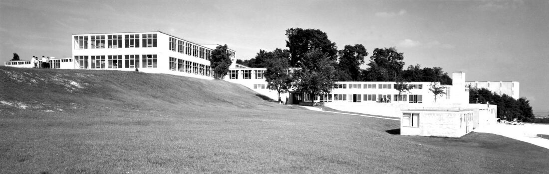 It's post war time. Germany has lost the war to end all wars. The country was in a state of confusion, one second they were Nazis and now they are not. Now they have to listen to the big allied forces that tell them to reconsider being mean to everyone else and get a good slap on the head. Germany looks back on its good old days, the good old days of the Bauhaus. 'Wow weren't we cool then? With our revolutionary art school? Wasn't that cool?' So they quickly(ish, took them until 1953) decided to open a new art school in Ulm. The school had its own proof to the big scary allied forces that it wasn't part of that Nazi elitist nonsense and was founded by Sophie and Hans Scholl two members of the White Rose (an anti fascist group) who subsequently died in World War II for throwing out some anti Nazi flyers. The school itself was very anti Nazi and that was exactly what America and Europe wanted to see. So they decided to give it some funding to help set it up so the school could in some way or another help with the reformation of Germany. And that's how the HfG Ulm came to be.
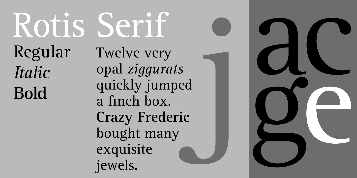
household until the war ended later that year. After the war he married Inge Scholl. Then later in 1953, he and his wife started the HfG there he became involved in corporate design and did most of the corporate branding as well. He was a pioneer in a lot of corporate design. Sadly in 1968 the school we know as HfG closed down due to social implosions with students objecting to the social justice-ness of the education system held within the school, believing that being socially good does not automatically mean good design. However Otl in his career helped to create many of the logos we know today. Mainly most notably he designed the 1972 Munich Olympic symbols that are still used to this day, he even did some of the symbols for airports one more notably in Athens, Greece. He even later created his own font family known as Rotis and designed logos for Munich airport, Braun as well as the University of Konstanz.  In the 1910s the world was about to birth something new, something amazing, something revolutionary and that something was the Bauhaus school of art. An art school that taught other things than art which is the best and only way to teach art students, in my opinion, because art students are hilariously good at procrastinating and doing anything else other than art. In all seriousness, the Bauhaus school was the school to become other schools, the main reason that today we have art foundation courses and we are taught art the way we do. Where we don't specialise in one technique or another but rather teach ourselves a little bit of everything from every medium we can.  The teaching methods of the Bauhaus were similar to the modern day foundation course, as previously mentioned. The preliminary course was the one most similar to it, where before they could be allocated to specific workshops where they would train and study to become world face architects or product designers or artists they would have to learn the basics of art and to become individual people. Johannes Itten was one of those who taught at the Bauhaus as a master (doesn't he look like a zen buddhist monk in that picture or is it just me?) In the Bauhaus itself Itten encouraged those who worked under him to embrace their own thoughts and feelings and put it into their work. He himself specialised in colour theory, and the paintings he created were quite amazing in my opinion. Itten was born in Switzerland in Sudern-Linden and before becoming the renowned artist and master he became he actually trained to become an elementary school teacher. Then later in 1909 he went ahead and studied in École des Beaux-Arts in Geneva but was disappointed by the tutors there and so returned home. He was taught under Ernst Schneider at the Bern-Hofwil Teachers' Academy which later helped him teach at Bauhaus. But before Bauhaus Itten opened his own private school in Vienna which was where he adopted his basic shape style where he would use circles, squares, rectangles, spirals to create pieces which described colour. He would also not correct individual students if they had made a mistake but rather would correct the class as a whole, this was also taught to him from Schneider. He joined the Bauhaus and taught in the preliminary course from 1919 to 1922. There he taught starting up students composition, material characteristics and for what he's known for; colour. Itten devised his own colour theory which were all the variants of contrasts in colour such as hue, temperature, compliments, value and saturation. His lessons also sometimes included gymnastics and relaxation techniques to help improve students creativity. Itten later went on to publish his own book which was all about colour theory and he developed the 12 colour wheel (as seen below). When Bauhaus closed he went on to open his own weaving school with the help of a fellow Bauhaus weaver Gunta Stolzl. 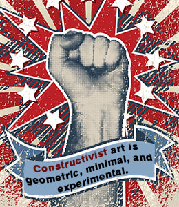 I was probably one of the many that believed that modern art began when Andy Warhol popped out of nowhere and started using stuff and making it into art to annoy people, I was almost surprised to find out that modern art was something that began a long time before that. It all began when people stopped caring about recreating art by the classics from the renaissance and instead looked towards the future, which was considerably wild back then. Modernism has a meta narrative and always questions itself as much as everyone else questions it. and it has a timeline of influences and how those influences influence each other and create it's own influence baby. That baby is modernism. From modernism stems a lot of other branches from the cubists to what I'll be writing about today which is constructivism. Constructivism was developed in Russia, it revolutionised the idea of propaganda art and design. It was used in the beginning of communism, and it's probably one of the sole reasons we see red and probably think straight away about either Russia or communism. It's whole idea was to combine psychology and minimalism to sway the Russian people. It was anti-western and probably gave the people of Russia a sense of pride given the fact it is quite appealing, even now.
shows how Lissitzky uses black and white print effectively. He also uses red in significant parts of the poster where it draws you in. I feel the face is what unnerves me the most. Way to make Russia look like an evil overlord that's always watching. Its possibly the eyes combining into one where the boy and the girl meet and on their forehead all it reads is USSR. You as a person belong to the USSR and that's it. Overall it's quite fascinating how a poster can make you feel so uneasy yet so compelled at the same time, the use of the text and the geometric shapes is so effective that you just want to stare at the poster for some strange reason.
you consider it as a documentary as well as a revolutionary one which brought in many new techniques never seen before on cinematic screens. The buildings stand tall as if they're towering over you and yet it also reminds me of the first time I went to a big city like Liverpool and all I could do was look up in wonder, in the same way the drawing of the dismantled woman is spreading out her arms, her dainty little heels and legs make her look as if she's dancing and it all creates this sense of strange wonder.
Art Nouveau has always been something that I've been aware of but never really cared to look into, not that it didn't particularly interest me but it's never been something that stands out. Perhaps it's because humans have always looked at organic forms in their art and design and how they can make their work look more like a natural part of the world rather than something unnatural. Art Nouveau was the master of trying to make things look just peachy and fairy-like with their whiplash like lines that only remind me of vines or weirdly enough seaweed, and seaweed kind of grosses me out. There's nothing wrong with natural of course, and the art produced by those who were influenced by the movement did produce some really good pieces, I guess I never understood the excitement over it. It's been done before and it'll be done again in the future in another sort of organic form.
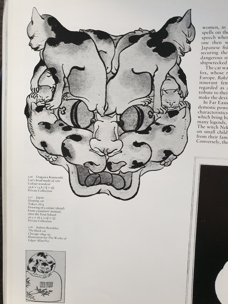
The Art Nouveau movement went the complete opposite way to the simplistic and effective nature of the arts and crafts movement, they wanted to go back to being surrounded by nature and flowers and daisies by bringing nature into the home and into art. Charles Rennie Mackintosh from Scotland was one of those who was the main influencer of the movement, I would particularly use his stained glass works to show how he influenced any successors of the movement. He was also a part of the reason why Vienna was influenced by the Art Nouveau movement. Josef Hoffman was one of the Viennese Art Nouveau influencers who went on to design chairs, unlike the predecessors in the arts and craft movement who loved the simplicity of design, and the craft that goes behind Josef Hoffman really did love to add unnecessary wibbly wobbly lines and strange decor all over his chairs. Well, it does get credit in the fancy department at least. Meanwhile in Barcelona, a man named Antoni Gaudi was busy making possibly the most bizarre buildings and in fact transforming the entire city into this strange organically formed structures. His work almost seems alien to me, in fact I once visited Barcelona when I was about 10 and didn't really understand the architectural significance of Antoni Gaudi's work, or the fact that even now the Sagrada Familia is being built. Perhaps the reason why we as people think of the buildings as so strange and alien is because we're not quite used to buildings being so... artsy. Throughout history a building has been shaped in its efficient form. A house is a square or a rectangle for a reason, a church has all its decor to celebrate a god or gods, a skyscraper is a skyscraper because it wants to boast its prosperity to the rest of the world. Having this very organic form as a building seems so foreign to us. Out of all the Art Nouveau pieces I've seen and researched I think Antoni Gaudi has to be my favourite, despite the criticisms. There is something quite amazing about his lifetime work, and the fact a single man is able to transform a lot of the city. .The year is 1850 something or another, and Japan is about to get the culture shock of its life. That culture shock being America forcing Japan to open it's tiny floating world up for the rest of the world to find out what its secrets were. Japan has been a bit of an obsession of my own since I was around 10 and watched probably way too many cartoons. It stemmed from anime and manga and eventually evolved into this curiosity about Japan, even now as it is sometimes the country as a whole feels like one huge mystery. It's always also been one of the greatest places for illustration and art in general, it could be seen as the smartass of the world. It was smart, and it was good, and it's always known its been good. So to hear about Japonism in the 1800s was no surprise to me, the west has always had a weird obsession with the east, or perhaps its just an obsession with what seems so unattainable, and an entire country blocking itself off was the perfect little treasure trove for western artists to unlock and discover. For the two pieces of art I decided to compare I took a look at a book on Japonism and found a section that took my fancy. That section being cats. What really took me by surprise was the Theophile Steinlen poster of Le Chat Noir being so influenced by the way Japan drew cats. It doesn't seem that obvious at first, but when I took a look at everything else that was cat related during the 19th centure seemed the same as everything else you would think of when it comes to a classical painting. The lines for the poster of Le Chat Noir are very flowing like it was done with a paint brush, the sharp claws of a cat reminded me of the way Japanese artists always drew the claws of a demon, and that linked up with what Japan thought of cats in general. Apparently in Japanese folklore Japan thought cats were in fact demons, or oni. As well as being demons at night they would become young women that would probably seduce every man within sight, sort of like a cat does when it feels like being affectionate. The other part of the drawing that is similar to the characteristics of the Japanese art was the face. It definitely does resemble a cat but there's something almost quite evil about it in both the poster art and the original Japanese art it's almost as if they knew from the start that cats are definitely going to take over the world at some point within the near future.
|
Authorhello i'm phoebe! if you somehow stumbled upon this blog congrats! if this was sent to you also congrats! you made it!!! Archives
December 2021
Categories |


 RSS Feed